This is a UX failure I experienced.
My default media player in Windows 10 is Microsoft’s “Films & TV” app. So most .mp4 or .mkv files I have or produce I play through this app.
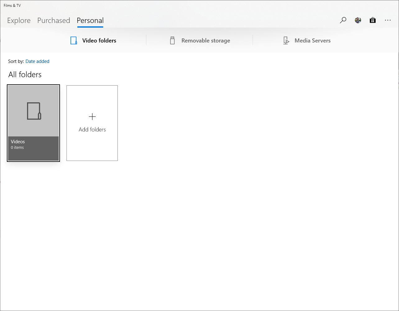
The problem is, if my focus is on the app and I press the backspace button (which can happen if I’m working and switching between multiple screens), I go from a playing video to the following:
So, where the UX fails and I become lost is: how do I get back to the file I was just playing?
There is nothing on the screen that indicates this possibility.
And exploring the few extra options (including a back arrow that only appears after moving between “Explore”, “Purchase” and “Personal”) yields nothing.
In the end I have to go back to Windows Explorer and re-execute the file.
(Now I think about it, the application doesn’t even have a typical “File” menu to find and open a file directly.
I call this a fail because I cannot simply “go back” to the file I was playing.
I would expect this from a default operating system application in 2019.