I’m putting together a new website today and implemented the classic web developer test: I set a background color of red on a div to check my build system was refreshing.
It worked. But with an odd side effect.
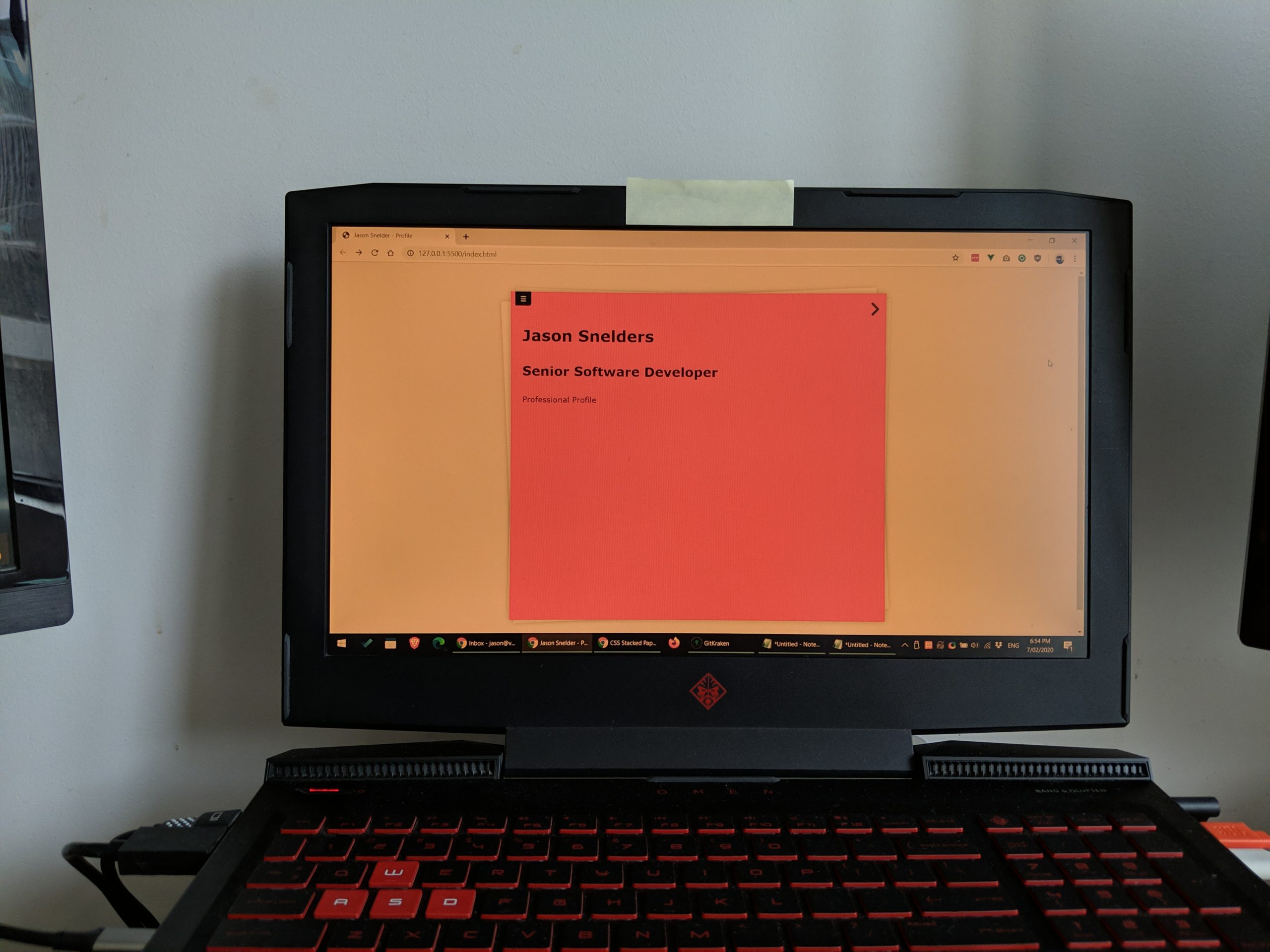
The red I saw looked pink on one screen (my laptop screen, in fact) and different shades of red-ish on my other 2 screens.
I have a 3-display setup at home – my laptop screen with 2 connected monitors on either side. I also run an application called F.lux all the time which essentially sets a night light (reduces blue light and runs a softer colour). But even with that turned off I still had colour variations across all three screens.
Unfortunately I couldn’t take a good enough picture to show the contrast clearly, but hopefully the following 2 photos give some idea:

Regardless, the moral of this story is:
No matter how precisely you design the colour of software or websites to look, there is no guarantee users will see what you expect them to see.
Keep your designs simple, focus on contrast and hope for the best.
And remember, there’s always grey scale to fall back on.